css_basic
CSS
CSS like a painter, it styles your house to make it beautiful, it allows you to create rules that specify how the content of an element should appear(for box: background, border, margin, padding, width, height etc, TEXT: font, color), these setting are html element styles, but set outside of html for better management, that means you need to know
- what to be set (html element style property)
- how to set it (css syntax)
html element’s styles(border, color, font) can be set with below order(the first one have the highest priority)
- inline, inside each element(< color>)[used for just one element]
1 | <body style="background-color: linen"> |
- internal css(style at header)[used for just one page]
- external (css)[used for whole website, many pages can share the same css file]
- browser default setting
how css works
css associates style rules with html elements by SELECTOR DECLARATION
1 | /* |
two ways to apply CSS
external
1 | <head> |
internal
1 | <head> |
Always use external for production env, the reason is:
- multiple pages can share the same css
- decouple css with html code, easy for maintenance
- client only needs to request file once if shared by pages, fast
More rules matched, which one should be used?
if two selector are identical, that latter one, that means
- if has inline, always use it
- else see the position of external and internal, use later one
- else use browser default.
if one selector is more specific than the others, the more specific rule applies
special add !important after property value, just this value used for this property!!
CSS selector
Simple Selectors

CSS Combinators
There are four different combinators in CSS:
- descendant selector (space), son, grandson etc
- child selector (>), direct child, only son
- adjacent sibling selector (+), has same parent
- general sibling selector (~), has same parent

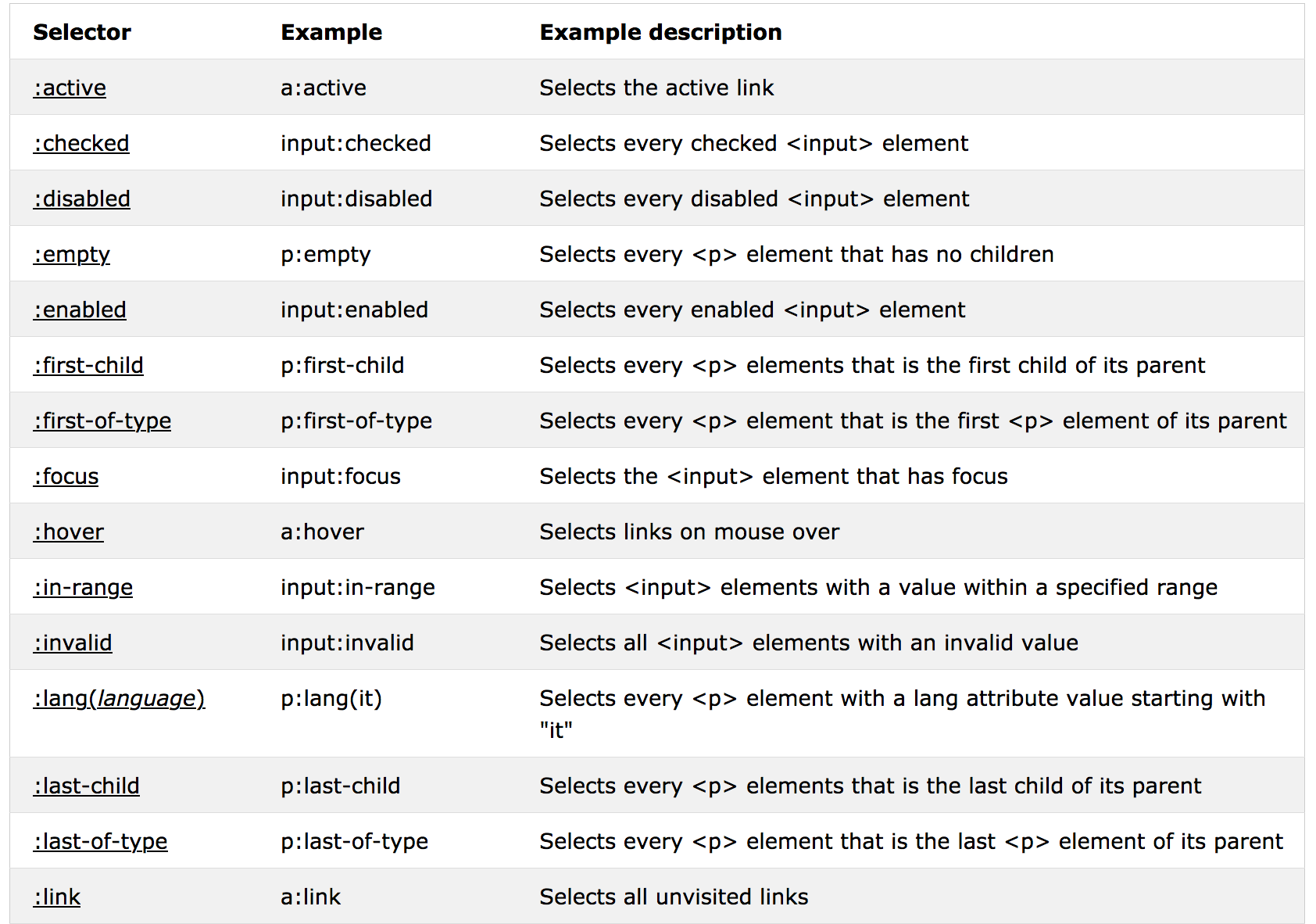
CSS Pseudo-classes


- active state means mouse clicked not freed state
- checked state for input element like check box etc
- enabled state for input element as well.
- focus state for input element when clicked, cursor is there
- invalid state for input element when invalid value, like email but input is not
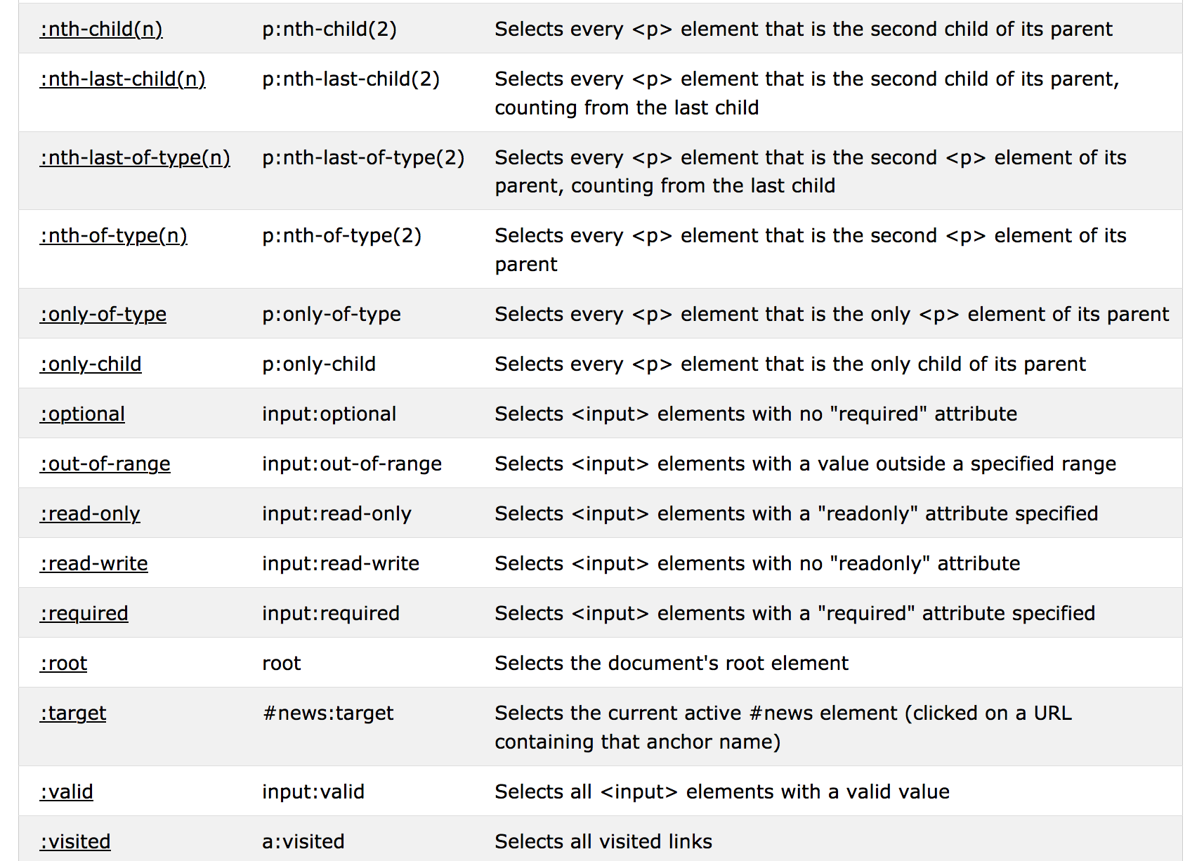
- out-of-range state for input element when value is out of range, like number with range(1,10), input 11
- first-child and first-of-type both say direct child
- nth-child(n) and nth-of-type(n) both say direct child as n index, index from 1
- only-child and only-of-type both say direct child
Pseudo-class always combines with selectors, here are some example
1 | div:hover p { |
Pseudo Elements
It’ used to insert content or change first-line or first-letter, the content can be a string or url, more details about the content, refer to content format

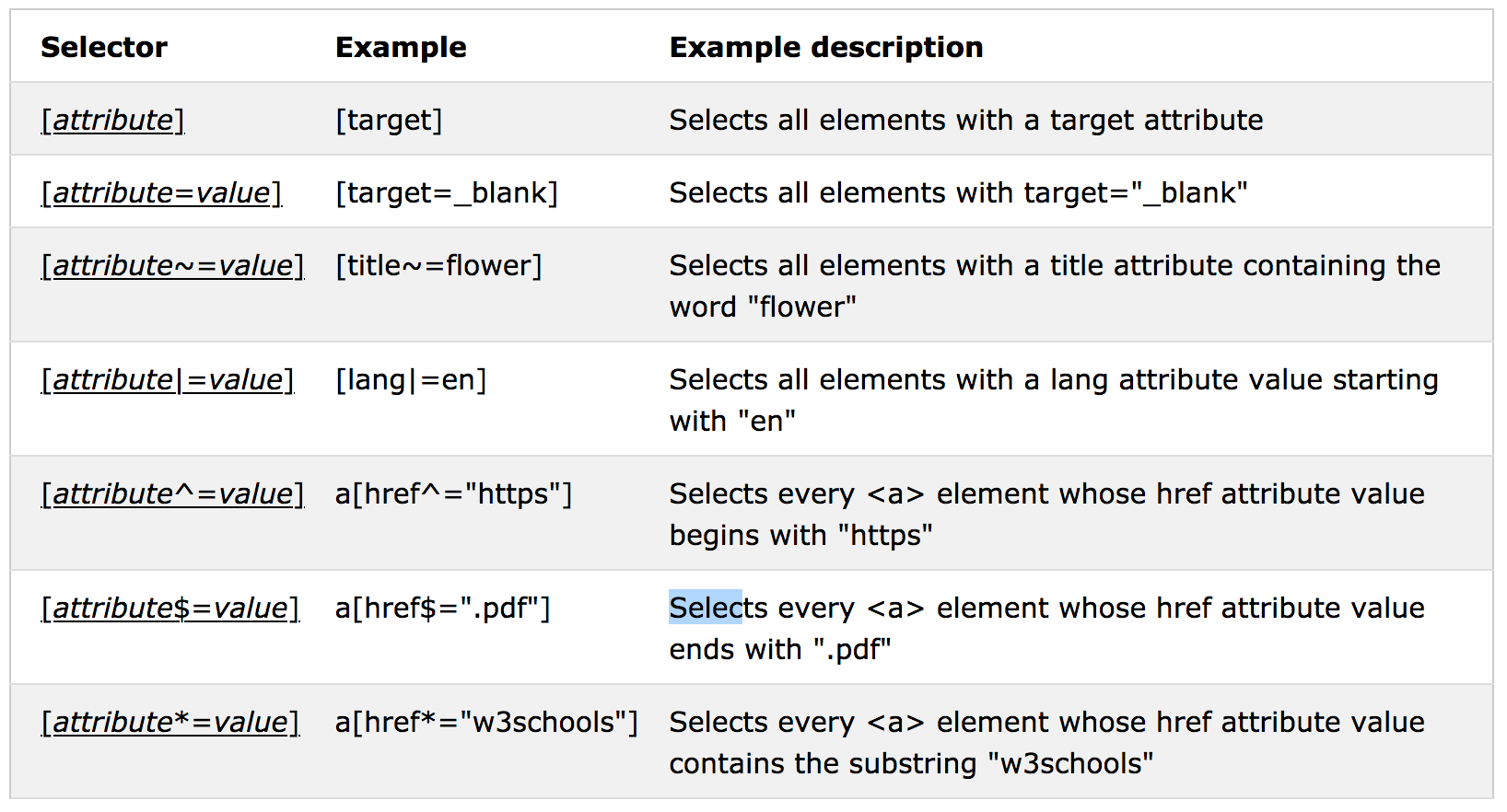
Attribute Selectors

Similar attribute selector
[attribute|=value] [lang|=en] Selects all elements with a lang attribute value starting with “en”
en must be attribute value, hence match a whole word[attribute^=value] a[href^=”https”] Selects every <a> element whose href attribute value begins with “https”
https can be part of attribute value, part of word[attribute
=value] [title=flower] Selects all elements with a title attribute containing the word “flower”flower must be attribute value, hence match a whole word[attribute*=value] a[href*=”w3schools”] Selects every <a> element whose href attribute value contains the substring “w3schools”
w3schools can be part of attribute value, part of word
Note: regular pattern ^, $, * just do matching as a string, |, ~ matching with meaning, it must be an attribute value.
CSS property
CSS Property Groups
- Color
- Background and Borders
- Basic Box
- Flexible Box
- Text
- Text Decoration
- Fonts
- Writing Modes
- Table
- Lists and Counters
- Animation
- Transform
- Transition
- Basic User Interface
- Multi-column
- Paged Media
- Generated Content
- Filter Effects
- Image/Replaced Content
- Masking
- Speech
- Marquee
This is just groups, not specific property, all properties refer to css reference
Background
1 | div { |
Background can be set with an image, but the image may be not so big to fill the full content of view, hence we can set ‘repeat’ or ‘position’, ‘scroll’ for the image.
background-size
The background-size can be specified in lengths, percentages, or by using one of the two keywords: contain or cover.
- Without background-size: img stays its original size, if area is large, some part is not cover, if area is small, the overflow part is hidden
- cover: the cover keyword scales the background image so that the content area is completely covered by the background image, so part of image may out of area.
- contain: the contain keyword scales the background image to be as large as possible (but both
its width and its height must fit inside the content area), the part of area may be not covered at all.
1 | body { |
Note: you can set background for every element like body, div, input etc, it’s only applied to that element!!
Border
Border has four sides, top, right, bottom, left, you can set properties like ‘style’, ‘width’, ‘radius’ for each side separately or define two(top, bottom pair, right, left pair) or four side as same. but with Shorthand, the four sides must be same!!!
- border-xxx-style border-style
- border-xxx-width border-width
- border-xxx-color border-color
- border-radius
1
2
3
4
5
6
7
8
9
10
11
12
13
14
15
16div {
border-top-style: solid;
border-width: 10px 10px;
border-color: red;
border-radius: 5px;
}
/* Shorthand does NOT include radius with below order
border-width
border-style (required)
border-color
*/
div {
border: 10px solid red;
border-radius: 5px;
}Margin

Margin can be set for each side separately with specific property, or set with one property(Shorthand), the values:
- auto - the browser calculates the margin(only works for block element)
- length - specifies a margin in px, pt, cm, etc.
- % - specifies a margin in % of the width of the containing element(mostly % of its parent’s width)
- inherit - specifies that the margin should be inherited from the parent element
Top and bottom margins of elements are sometimes collapsed into a single margin that is equal to the largest of the two margins.This does not happen on left and right margins! Only top and bottom margins!
1 | p { |
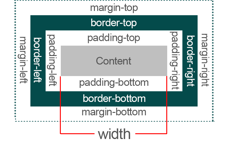
The width of an element does not include padding, borders, or margins by default. but you can include border, padding with box-sizing: border-box;
For auto, the left margin receives a share of the unused horizontal space, as determined mainly by the layout mode that is used. If the values of margin-left and margin-right are both auto, the calculated space is evenly distributed. if only margin-left set, the unused horizontal space added as margin-left, move the item right align, more details refer to margin auto.
Padding
The CSS padding properties are used to generate space around an element’s content, inside of any defined borders, it has the same format as margin.
1 | p { |
Width and Height
The height and width properties are used to set the height and width of an element.
The height and width properties do not include padding, borders, or margins. It sets the height/width of the area inside the padding, border,and margin of the element.
The height and width properties may have the following values:
- auto - This is default. The browser calculates the height and width
- length - Defines the height/width in px, cm etc.
- % - Defines the height/width in percent of the containing block, special for img
- inherit - The height/width will be inherited from its parent value
Note: For img if the max-width property is set to 100%, the image will scale down if it has to, but never scale up to be larger than its original size. same thing for video.
The max-width property is used to set the maximum width of an element, the element size scroll when window changes, it’s respective, but width has fixed size, hence on small window, some of the element may be out of window.
OutLine
An outline is a line that is drawn around elements, OUTSIDE the borders, to make the element “stand out”, it has the same format as border does, ‘style’, ‘color’, ‘width’. but can’t set each side!!!
1 | p { |
Text
Text has several properties you can set by CSS like color, alignment, decoration, transformation, space, shadow.
- The color property is used to set the color of the text.
- The text-align property is used to set the horizontal alignment of a text
justify: each line isstretched so that every line has equal width - The text-transform property is used to specify uppercase and lowercase letters in a text
- The text-indent property is used to specify the indentation of
the first line of a text - The text-shadow property adds shadow to text.horizontal shadow and the vertical shadow
1
2
3
4
5
6
7
8
9
10
11
12
13p {
background-color: white;
color: black;
text-align: left;//"justify", each line is stretched so that every line has equal width, and the left and right margins are straight (like in magazines and newspapers)
vertical-align: middle;
text-decoration: underline;
text-transform: uppercase; //capitalize
text-indent: 10px;
letter-spacing: 2px;
word-spacing: 3px;
line-height: 2;
text-shadow: 2px 2px red;
}Font
The CSS font properties define the font family, boldness, size, and the style of a text
1 | p { |
Icon
The simplest way to add an icon to your HTML page, is with an icon library, such as Font Awesome, Bootstrap Icons, Google Icon
1 | ... |
list CSS
The list-style-image property specifies an image as the list item marker.
1 | ul.a { |
position related
Normal flow(default): every block-level element(start with new line) appears on a new line, causing each item to appear lower down the page than previous one, even if you specify the width of the boxes and there is space for two elements to sit side-by-side, they will not appear next to each other, this is the default behavior!
Relative position
This moves an element from the position it would bein normal flow,shift it to the top, right, bottom, or left of where it would have been placed, thisdoesn't affect the position of surrounding elements, they stay in the position they would be in normal flow
(relative—relative to where they would be in normal flow when set offset top, right, bottom, left),if no shift set, relative position has no difference with default.1
2
3
4
5div.relative {
position: relative;
left: 10px; // move left from normal flow
border: 3px solid #73AD21;
}Absolute position
This positions the element in [relation to its containing element], It’s takenout of normal flow, it could affect sibling elements, as it has the fixed position in the container.
Positioned relative to the nearestpositioned ancestor(instead of positioned relative to the viewport, like fixed)
However; if an absolute positioned element has no positioned ancestors, it uses the document body,A "positioned" element is one whose position is anything except staticFixed position
This is a form of absolute positioning that positions the elements in relation to the browser window!!! as opposed to the containing element! they don’t move when user scrolls up or down the page!
(absolute—the browser window!!!) it’s always fixed to the window, out of flow, can affect any element in the view!!!
z-index
When positioned with three ways, element may overlap each other,t he z-index property specifies the stack order of an element, an element with greater stack order is always in front of an element with a lower stack order.
Note: z-index only works on positioned elements (position: absolute, position: relative, position: fixed), default 0
Media Queries
Media queries can be used to check many things, such as:
- width and height of the viewport
- orientation (is the tablet/phone in landscape or portrait mode?)
- resolution
it returns feature of given media type, then we use that result do some expression to define different values of element.
1 | //When a media query is true, the corresponding style sheet or style rules are applied, following the normal cascading rules |
mediatype:
- screen
features
- height The viewport height
- max-height The maximum height of the display area, such as a browser window
- min-height The minimum height of the display area, such as a browser window
- min-resolution The minimum resolution of the device, using dpi or dpcm
- max-resolution The maximum resolution of the device, using dpi or dpcm
- max-width The maximum width of the display area, such as a browser window
- min-width The minimum width of the display area, such as a browser window
- width The viewport width
Variable
Variables in CSS should be declared within a CSS selector that defines its scope. For a global scope you can use either the :root or the body selector.
The variable name must begin with two dashes (–) and is case sensitive!
1 | :root { |